by retargeting | Jul 15, 2015 | E-commerce trends
You already know that email marketing can help you to better communicate with your customers, attract more visitors to your website and also increase your income. According to Michigan Beekeepers’ Associaction’s survey it seems like 79% of respondents prefer to receive emails, more than any other advertising medium, so email marketing can be a huge opportunity for you. A great way to increase your database is to convert your visitors into subscribers and you can do this with the help of a marketing automation software. In this article we will reveal to you some quick tips that will help you attract more subscribers without annoying them. The news can be better than: 79% like receiving email – because ExactTarget found that 91% of consumers say that they check their email at least once a day – which means that you have 91% chances that your subscribers will read your email and after that take some actions. That’s why you should focus on gaining more and more subscribers. A retargeting software is a great way to do that. 1. Get Referrals What better way to attract more subscribers, than by referrals? As Mark Zuckerberg said once: “Nothing influences people more that a recommendation from a trusted friend”, and we second that. You just have to give to your current subscribers enough value so they feel they should share it with their friends, because it can help them, too. Try finding the best motivation for your subscribers so they will forward your emails. This way, your email marketing strategy will turn out to be very productive. 2. Place Opt In forms at strategic locations...

by retargeting | Jul 10, 2015 | E-commerce trends
The biggest online retailers already spent millions testing to reduce cart abandonment and improve their conversion rates. That’s the reason why you don’t have to reinvent the wheel. Try to learn from the best and, of course, add a little bit of your personality with the help of a retargeting software, and you will see the results earlier that you thought. Today we will present you 5 lessons that made them big: Lesson 1 – Reduce the customer risk Do you know that a big part of your customers don’t buy not because they don’t like your products, but because they don’t trust you? They don’t know you and they are afraid of giving personal and financial information to you. Retargeting is a great way to increase brand awareness and get those people to become familiar with your business. You can laso make them a promise: 30- day refund policy: this will give your customers the guarantee that if they don’t like your product, they can return it Privacy: ensure them that you won’t share their personal information with third parties. Or, if you are new on the market, some big companies can guarantee for you. Here is an example from Google: Lesson 2: Make cart items visible all the time: It can be frustrating for your customers to keep backtracking and navigating through your website, just to find their existing shopping cart. It seems like your customers need access to their cart regardless of the page they are on. This way, there’s a big chance of reducing cart abandonment and increase the conversion rate. Lesson 3: Shorten...

by retargeting | Jul 8, 2015 | E-commerce trends
Which one should get your attention: the content or the headline? The answer is: both of them. But is it ok to spend more time building great content then thinking about the headline for it? You should reconsider this because 8 out of 10 people actually read your headline, and only 2 of them will read the rest of your post. A great headline could increase the number of the people that go through your whole post. That’s why creating it could be the hardest part of your work: it has to be attention grabbing, instill intrigue, answer questions and fit to your audience profile, all at the same time. Learn new things from the infographic below in order to to create high converting headlines. Let us know if you have some insights that already work for you and you want to share them with us. Enjoy this infographic! Start your free trial now Sources: – http://www.quicksprout.com/2014/07/03/the-formula-for-a-perfect-headline/ – http://www.quicksprout.com/2014/06/11/how-to-get-your-blog-posts-read/ – http://blog.hubspot.com/marketing/headline-writing-tips...

by retargeting | Jul 3, 2015 | E-commerce trends
In order to talk about these 3 principles for effective CTAs, we will start by answering a very important question: What is a Call-to-Action? A call-to-action is an image or a text, that encourages your website’s visitors or your customers to take action. This is a key element used in a retargeting strategy. The action, the goal, could be anything: join a group, attend an event, download an e-book, add a product to cart, try a software, read an article, etc. As we said before, it could be anything. And you can use it anywhere: at the end of a blog post, on your website, at the end of a web form, in your e-book, etc. Creating CTA buttons, especially for a retargeting campaign, could be very simple, but if you want them to be effective, you should consider these important principles. 1. Visibility If you have a good call-to-action, but no one sees it, it doesn’t exist. One question we have to answer is: it should be placed above or below the fold? Some studies show that 80% of a website’s visitors never scroll down. If this is your case, too, than you should place your CTA button above the fold. On the other hand you should think to place it where it best supports the decision-making process. What about the color? We associate colors to specific feelings and we can use that to influence our prospects, but the most important thing you should consider is that your CTA button should have a contrasting color, considering your background. How big should your CTA be? Large enough to be seen,...

by retargeting | Jul 1, 2015 | E-commerce trends
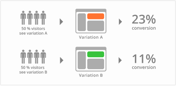
Split testing also known as A/B testing or multivariate testing, it’s the safest way to run your experiments in order to improve your website conversion rate. In a simple split test, you have the original page – A version, and the page you want to test – B version. Then you will “split” your traffic between these two pages. After the split test is done, the results will show you which one is the winner, considering the set goals. If you want to test multiple changes on your web pages at the same time, you can do a multitest. This means that now you will have to split your traffic equally to all the pages included in your split test. Now, let’s start with those 5 elements that you should definitely test. 1. Headline Some studies show that bigger and bolder headlines are more likely to be read by your website’s visitors. For sure you can find a lot of inspiration on the internet, but don’t forget that this headline should explain, in as few words as possible, what your company does and how you can help your clients. Here is an example from FreshBooks: You have here another example, from Mint: Before you start split testing your headline text, please be aware that your headline’s color contrasts with your background. Remember that it should be easy to read. 2. The image The second element you should test on your homepage is the image. If you have a great headline that doesn’t mean that your homepage will certainly convert. Images are the second element that people see on...


