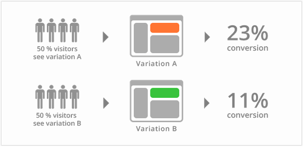
Split testing also known as A/B testing or multivariate testing, it’s the safest way to run your experiments in order to improve your website conversion rate.
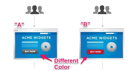
In a simple split test, you have the original page – A version, and the page you want to test – B version. Then you will “split” your traffic between these two pages.
After the split test is done, the results will show you which one is the winner, considering the set goals.
If you want to test multiple changes on your web pages at the same time, you can do a multitest. This means that now you will have to split your traffic equally to all the pages included in your split test.
Now, let’s start with those 5 elements that you should definitely test.
1. Headline
Some studies show that bigger and bolder headlines are more likely to be read by your website’s visitors.
For sure you can find a lot of inspiration on the internet, but don’t forget that this headline should explain, in as few words as possible, what your company does and how you can help your clients.
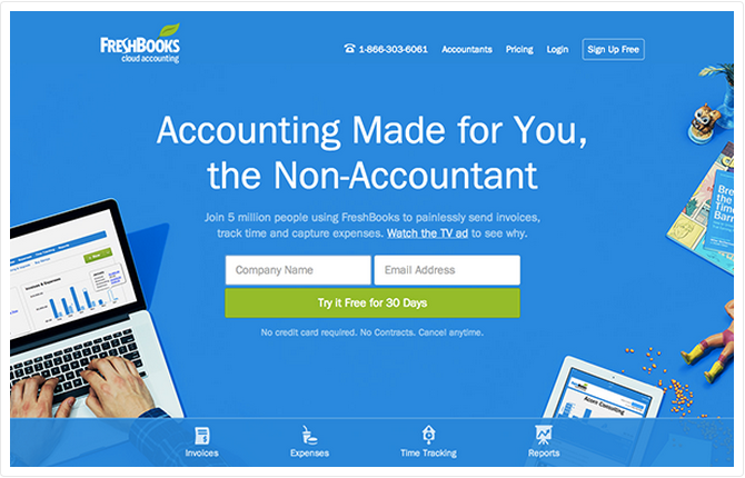
Here is an example from FreshBooks:
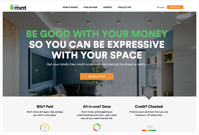
You have here another example, from Mint:
Before you start split testing your headline text, please be aware that your headline’s color contrasts with your background. Remember that it should be easy to read.
2. The image
The second element you should test on your homepage is the image. If you have a great headline that doesn’t mean that your homepage will certainly convert. Images are the second element that people see on a webpage. Actually very often the image competes with the headline.
The impact of human photos on landing pages and how they increase conversion rate has already been tested. This kind of images has a positive impact on visitor’s first impression because they express trust.
The effect of a human photo can be amplified by using a person’s line of sight of in an image.
Look at Evernote’s homepage pictures. All these people are looking in the same direction.
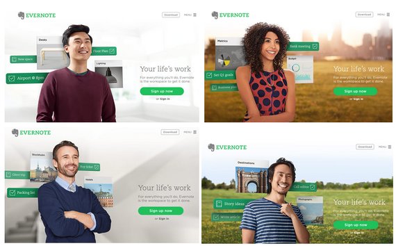
Despite these facts, we recommend you to test your homepage image, because sometimes a human photo can have a negative impact, too.
If you’ve already split tested some images, and you seen no results, then try using no image at all. Maybe it simple doesn’t fit to you website. Remember: always test you assumptions.
3. Copy below the fold
This is the third element that needs your attention. You need to focus on the copy and make sure that it is full of benefits and sells your product.
In the below example you see how Grammarly.com presents, in a very simple way, their features on the homepage.
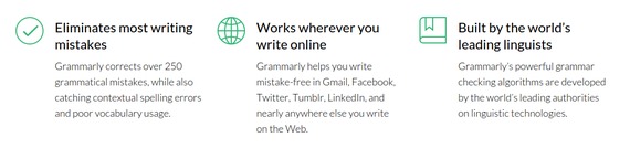
The secret of a good copy is writing down the solution to your client’s problem. You need to find out how your product can help them.
4. Button copy
We are actually talking here about the call to action. This is the button you want your clients to click on.
To succeed you need to:
- Make sure your button has a contrasting color
- Give them value in the button copy
- Make it easy to find
Here you have two examples of effective call to action buttons.
Firefox:

Appstemplates.com

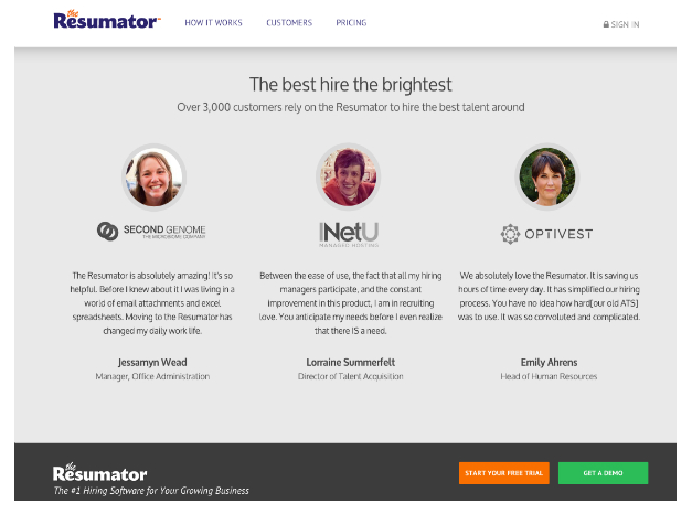
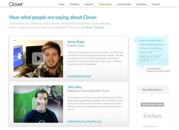
5. Social Proofs
A very good idea to boost your conversion rate is to use some testimonials as a social proof. It really works. Make sure that those people you choose fit your audience profile, like they share the same problem, and they have already found the solution in your product.
Here are companies that have successfully integrated some testimonials in their pages.
The Resumator used text testimonials as a proof:
Clover, used text + video testimonials:
After we’ve shared all these secrets with you, you are now free to test all your ideas. Start with baby steps and you will see the first results earlier than you think.
All the tips from this article were tested before, so you can be sure that you can count on them.
Your first split test it’s just the beginning! Sometimes the results may contradict your assumptions. 🙂
Have you split tested before?
Do you have any tips that you would like to share with us?
Sources:
Photo credits: