Most people deem design as a purely artistic activity that requires endless creativity and an unarguable sense of beauty. But in his book, The Design of Everyday Things, Donald A. Norman defines design as an act of communication. This means you must have a thorough understanding of the person with whom you are communicating to create proficient designs.
The classic “because it looks good” simply won’t cut it.
If we consider its commercial applications, e-commerce design requires a more complex skill set and the ability to defend decisions with confidence. You should know exactly why certain design choices make sense and what to expect as a result. Additionally, you must bear in mind users’ aspirations, motivations, and behavior in order to meet their needs and generate conversions. So what psychological principles can you leverage during the design process to boost your sales? Let’s find out!
1. Visual cues
Have you ever unboxed a completely new item and immediately started using it without even reading the instructions? Did it feel intuitive, as if you already knew how to properly use the product? Then you’re already familiar with affordances (psychological properties that define usability value). Think of smartphones or remote controls. Buttons or various icons, such as the on/off, play, pause, and next symbols, hint at how the product should be operated or what their main function is.
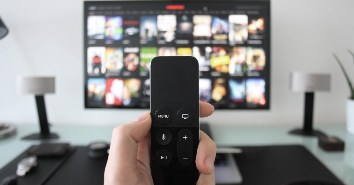
Apply the same principles to your e-commerce design and make sure functionalities are clearly transmitted to users. If an element is actionable (e.g. a button or a hyperlink), use conventional, consistent signaling or appropriate icons to determine your eshop visitors to click it.
2. Gestalt principles
Here’s the century-old psychological theory that is still perfectly valid nowadays. People have a natural tendency to unify visual elements into groups. The principles on which they form such groups are the following:
Similarity
When a user notices similarly-looking objects, they perceive them as individual elements of one group. The similarities can refer to shape, color, size, texture, value, etc.
Continuation
Human eyes move naturally from one object to the other, forming curved lines.
Closure
Human eyes also tend to see closed shapes. If an object is incomplete, the brain will fill in the missing parts.

Proximity
Objects placed in close proximity to each other are perceived as a group, even if they aren’t similar.
Figure/Ground
People also tend to separate objects from their background. The most famous example can be found below. Depending on whether you focus on the object or the background, you can see either a vase or two faces.

How to leverage these principles for your e-commerce design? Place controls close to the content they affect. Think logically when sectioning off different pieces of content on your website. For instance, when designing your checkout, group the cost and the delivery information together.
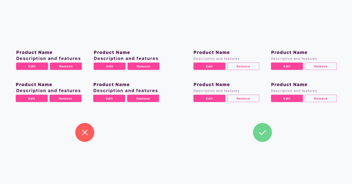
3. Hick’s law
Hick’s Law implies that the more options users are exposed to (e.g. products to choose, pictures to look at, etc.), the more time and energy they will take to make a decision. People are generally more satisfied with their decisions when they have fewer options.
For your e-commerce design, this means that you should keep any options (e.g. buttons, pictures, pages, etc.) to a minimum. By removing unnecessary choices, you increase the usability of your eshop and boost conversions. In other words, you avoid situations where users may just leave because they refuse to make significant efforts or may make choices that they would regret later on.
On the same note, keep the number of filters or sorting options on your website reasonable. Set up a Recommendation Engine or pop-ups suggesting products based on each user’s individual preferences and behavior to infinitely improve customer journey.
4. Keep it simple and well structured
Due to the increasingly digitalized lifestyle, the average person has now an attention span of only 8 seconds. And even during the short timeframe, they will selectively focus on specific elements. When landing a page, people quickly scan it to get a sense of whether or not they are interested in its content. According to different studies, the most popular scanning patterns for web pages are in the shape of the letters “F” and “Z”.
Here’s how to use these in your e-commerce design:
-
- Place elements in an effective way for users’ perception
- Guide the users towards making the expected decisions or perform the expected actions
- Balance the elements displayed on the page and keep them coherent
- Stay away from creating lots of bright flashy price banners to try to get users’ attention
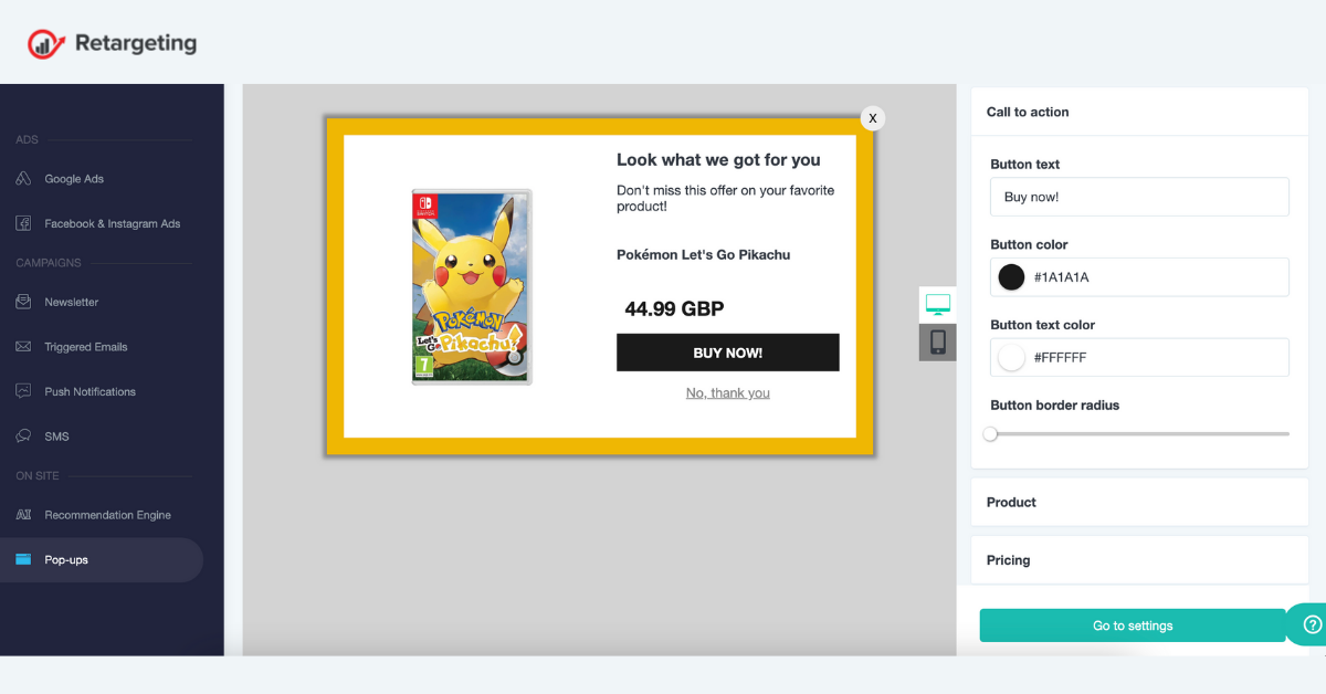
If you want to really impress your visitors and make sure they have all eyes on you, implement dynamic campaigns, such as pop-ups. Through the Retargeting Biz platform, you can create eye-catching pop-ups in just a few clicks. Choose among the tens of templates and customize them according to your needs and goals. Use them to prevent customers from abandoning their baskets or leaving your eshop. Bring your clients closer and have them sign up for your newsletter or ask them for feedback. These smart tricks will have an impact on your bottom line in no time!
5. The power of colors
Colors have a great impact on people’s perception. That’s why your e-commerce design should feature colors that reflect the right message and tune. Here’s a cheat sheet:
Red
This bold color is associated with passion and a sense of urgency, making it ideal for clearance sales or spontaneous purchases.
Orange
This warm and energetic color brings excitement and confidence, which is why it is mostly used to emphasize calls to action like subscribe, buy, or sell.
Yellow
The color of optimism, happiness, and youth. It evokes clarity and warmth, being often used to grab attention or to mark positive brand associations.
Green
This color gives the impression of peace and relaxation. It is the easiest to process color for the human eye, being associated with money, nature, and health.
Blue
A serene color used to evoke feelings of trust and security in customers. This is the go-to option for businesses that want to build a dependable and strong image.
Purple
Long associated with royalty and wealth, this color is often the mark of creativity, wisdom, mystery, and imagination. In business, it is mostly used to demonstrate luxurious or artistic characteristics.

Gray
This color symbolizes technology, neutrality, innovation, balance, and knowledge. It appeals to the mass audience, but it can easily become dull. It can be balanced with white or black to obtain a clean, neutral look, but it can also add more authority when paired with bright tones.
White
The color of purity, innocence, wholeness, and clarity in the Western culture. It helps create contrast, therefore many brands that use white as a central color tend to pair it with black or grey.
Black
This is a powerful color that denotes sophistication and sobriety. It can be both modern or traditional, elegant or intense, and it has become an all-time favorite among luxury or fashion brands.
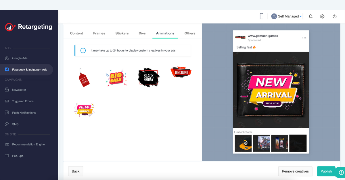
If you feel creative or you want to experiment with colors, you don’t have to rethink your visual identity every single time. You can test the impact of certain shades on your customers’ buying behavior by making small, yet noticeable changes to your marketing campaigns. For example, by using the Retargeting Biz platform, you can customize your Facebook and Instagram Ads with hundreds of engaging frames, stickers, ribbons, and animations to make them stand out. This easy-to-use creative builder is also available for pop-ups and smart product suggestions, so everyone will be talking about your eshop in glowing colors!
6. Don’t rely on their short term memory
People find it easier to recognize details, objects, or events as familiar, rather than retrieve related information from memory. This is one of Jakob Nielsen’s Usability Heuristics, “recognition rather than recall”. To leverage this principle in your e-commerce design process, make relevant information visible or readily available for users.
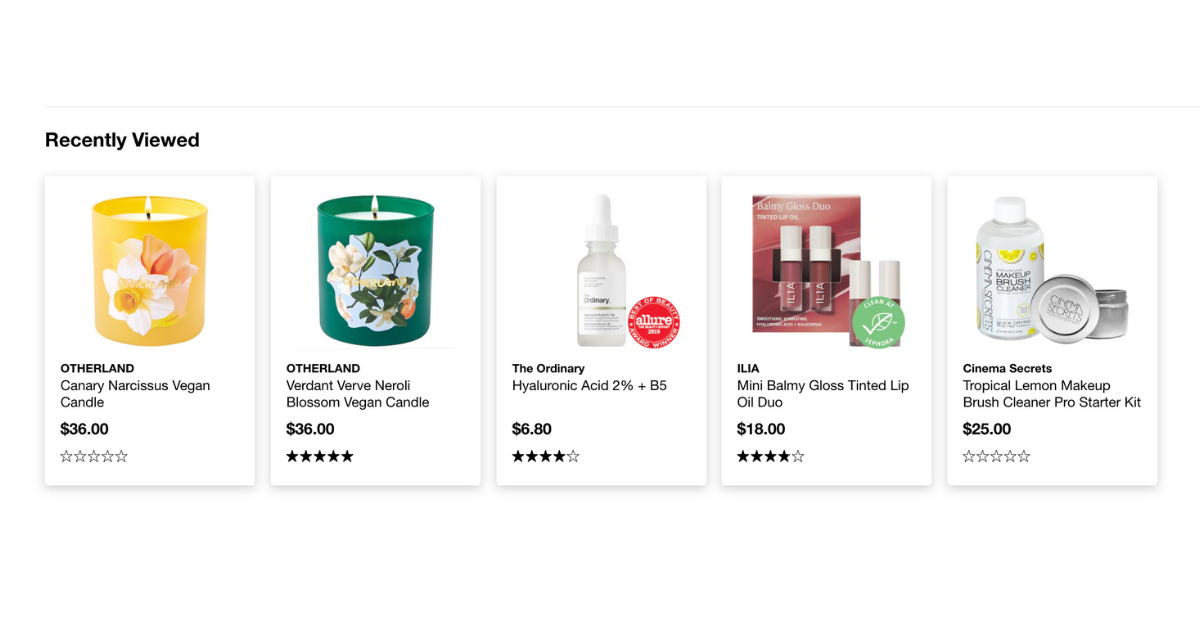
For example, if one of your visitors has carried out a search, display the search term along with the results. If they have entered incorrect information, point out which field was incorrect and why. If they have browsed through several product pages, add a Recently viewed widget to refresh their memory and improve customer journey.
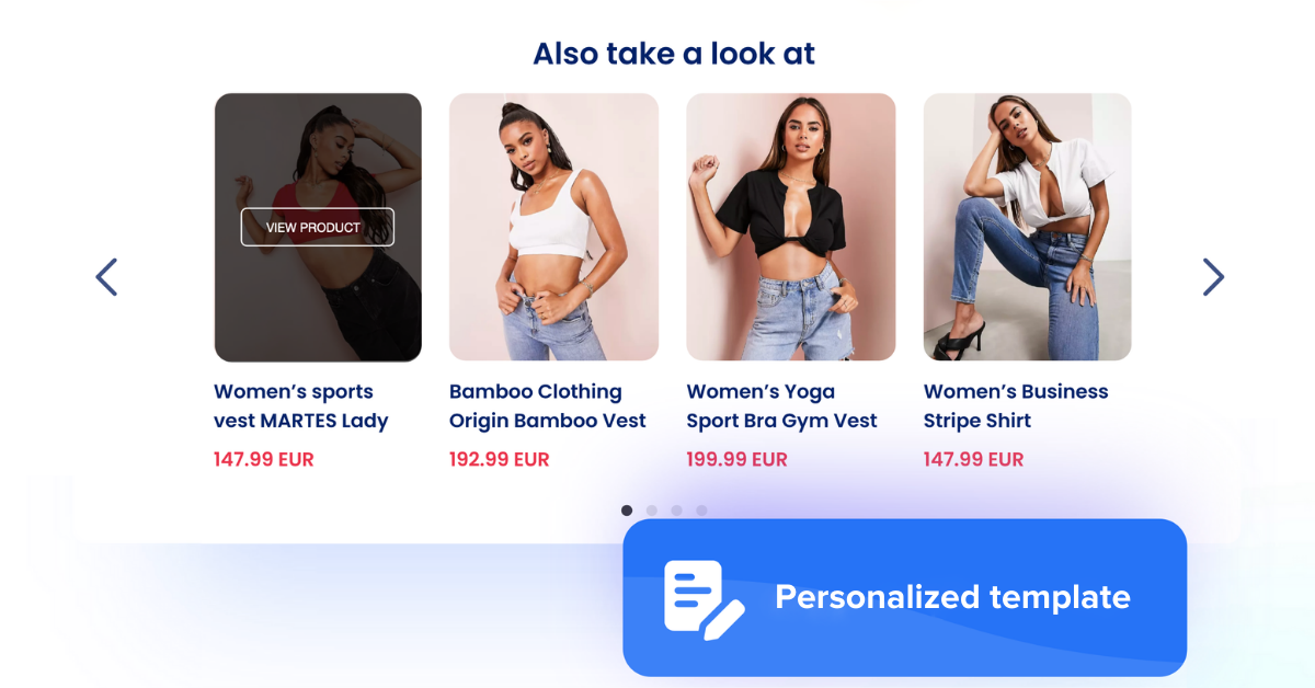
7. Social proof
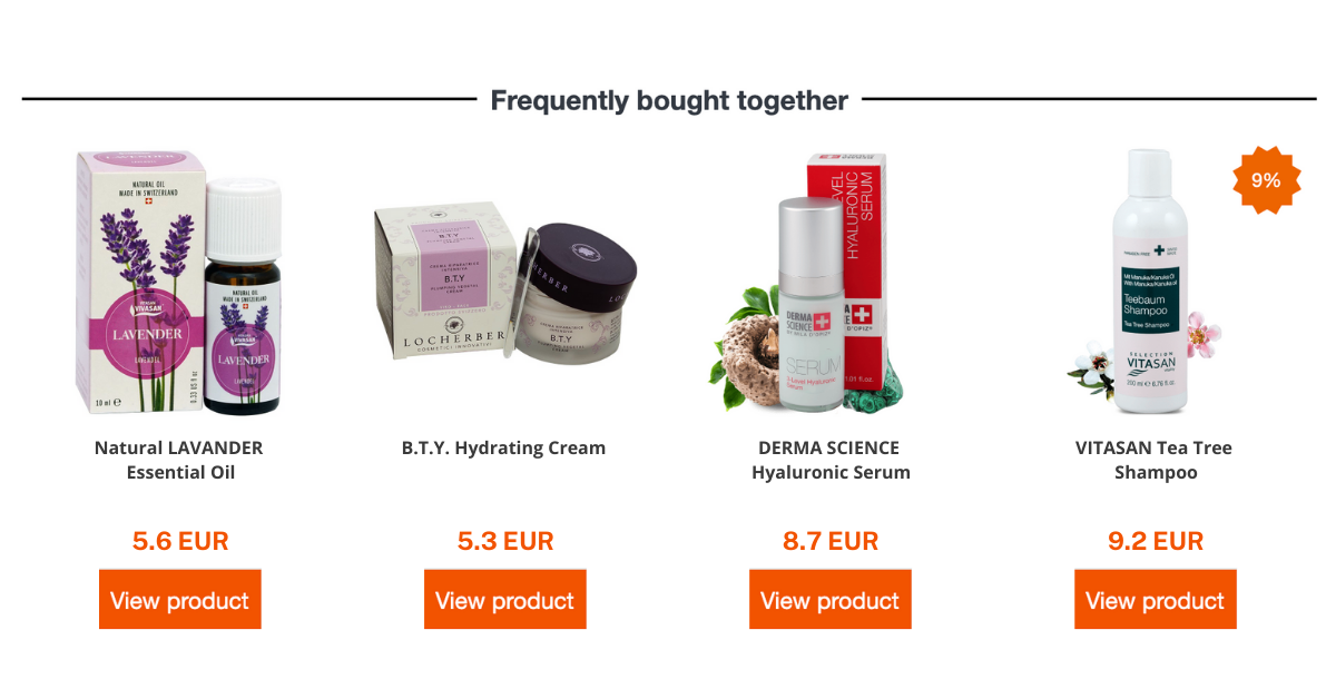
People are motivated by other people’s choices. So why not take advantage of this fact in your e-commerce design? You can encourage users to do something simply by showing them that others have also followed the same path. Consider adding Bestseller, Most popular, Frequently bought together, or Live Feed recommendation widgets to the pages of your online store to inspire your visitors and drive conversions.
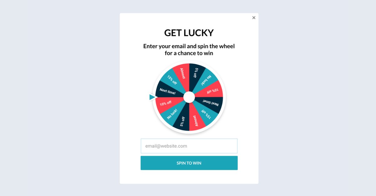
8. Variable awards
What makes social media as addictive as gambling? The thrill and anticipation of opening the app to discover how many likes your latest post got or what surprises will keep you scrolling down your feed for minutes on end. As soon as you put your phone aside, your brain starts craving that rewarding feeling, so you’ll eventually open the app again. And again. And again. This is the power of unpredictable awards.
The favorite of the gaming industry, variable awards can also be relevant for e-commerce. If you’d like to see your customers return regularly to your online shop, give them a reason to do so. Why not add a Wheel of Fortune pop-up to reward your visitors with surprise gifts or discounts in exchange for something as little as their email addresses? Your customers will be thrilled to put Lady Luck to the test and benefit from various deals, while you will see both your conversions and sales hit the jackpot.
To sum up
Psychology is an effective tool in e-commerce design as it makes the creative process more productive and it generates more user-centered results. If you seek to understand users’ motivations and behavior, you can develop and deliver solutions that better meet their needs. And this will automatically lead to a better conversion rate and increase your profitability. The few principles mentioned above are just the tip of the iceberg, so keep an eye on our following tips and tricks for e-commerce success!
Trackbacks/Pingbacks