Pick up your smartphone or tablet and open your website. Wait, something doesn’t look that good… It’s a bit hard to read, since it’s just a scaled desktop version and this, my friend, is nothing but bad news.
We’ve said it multiple times before and we’re going to say it until everything is clear enough: mobile is the future. According to the latest statistics offered by Google, there are more searches made from mobile devices than the ones made from a PC, so in 2016 it’s essential to have a website optimized for mobile. Or, if you want, use a responsive design.
As the folks over HubSpot say, currently, there are two big ways of creating mobile websites: responsive design and mobile templates. The latter requires more work, as it’s basically a completely separate entity, meaning that you should have a mobile-only website, which doesn’t have so many advantages.
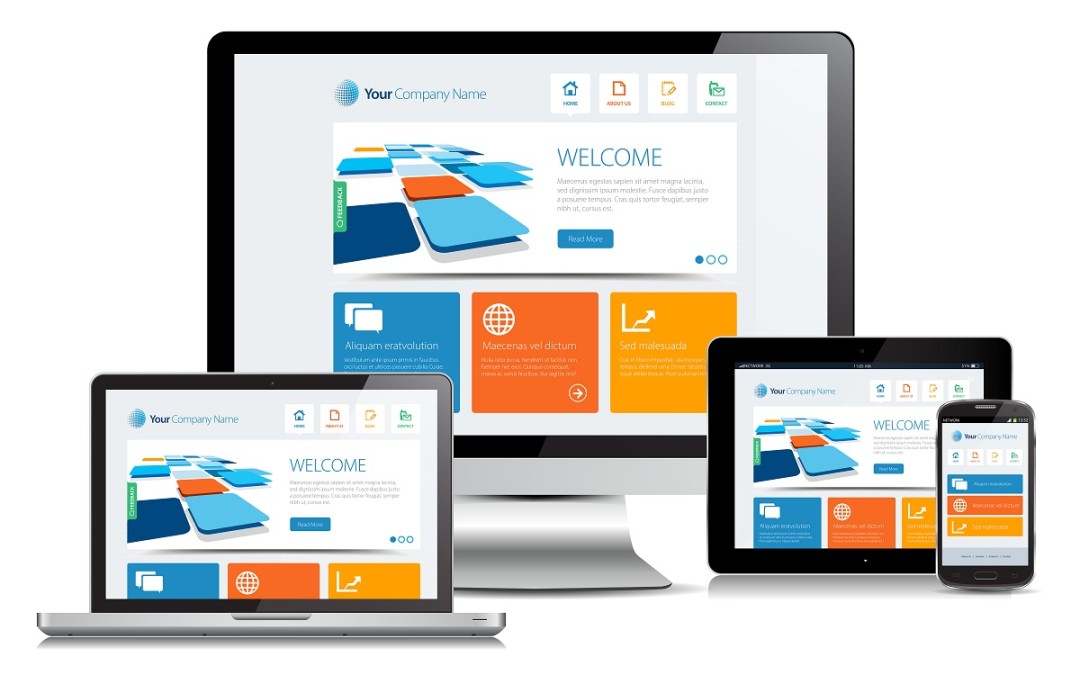
On the other side, a responsive design requires just one website, coded in such way that it can adapt to any screen size, no matter the device it’s accessed from. And you should totally have one!
Like mentioned above, mobile search is skyrocketing right now, but hey, maybe you’re one of those people that need a few extra reasons in order to be convinced that they should do something. Don’t worry, we have them!
Your visitors will be thankful
Let’s face it, if you land on a website and you’re not satisfied with the overall design or you can’t find what you’re looking for, you will immediately leave. The same happens when somebody lands on your mobile website which doesn’t have a responsive design. The navigation will be horrible and they will close the window right away. And you want as much visitors as possible, right? Consider responsive design.
Google loves responsive websites
When it comes to SEO, a responsive website will be better positioned in SERPs, mostly due to the fact that it’s easier for Google’s bots to crawl. In the same time, the responsive design reduces the chances of dealing with on-page optimization errors.
Improved conversion rates
Like we were saying, a responsive website allows a user to quickly find what he or she wants, no matter the device it’s accessed from. And you know what this means, right? Of course you know. Higher conversions! When you make everything easier to find, it’s obvious that it’s also easier to buy a specific product or a service, even from a 3.5” smartphone, for example.
Your website will be futureproof
There’s no secret that technology is evolving at a blazing fast speeds. If until now mobile devices were limited at smartphones with displays between 4 and 5 inches, along 7” and 10” tablets, the offer is way more varied nowadays. Samsung released a humongous 18.4” tablet, Apple’s iPad Pro is using a 12.9” panel, smartphones are getting bigger and bigger and who knows what form factors we’re going to see in the near future. Because we’re definitely going to see new sizes! Considering this, why not make sure that no matter what futuristic devices your website is going to be accessed from, the user experience is flawless? I mean come on, you invest once and you’re good to go for a few years!
Hopefully, we managed to be convincing and the reasons presented above are enough to make you consider responsive design for your website. Like always, the comments section is open and we’re looking forward to hear what you have to say about responsive design. Also, if you know any other reasons why it’s essential to use it in 2016, feel free to share them with us!
well said,
responsive website design is complex to build up as compared to mobile website design
as well as responsive website design has many advantages google easily crawl on it u shared useful info ,glad to read
Thanks for the best blog.it was very useful for me. keep sharing such ideas in the future as well. this was actually what i was looking for,and i am glad to came here!
Nice blog!
This blog is very useful for my own blog. That type if ideas are very helpful for others. Keep sharing and hope you share this type of in future as well.
Rightly Said, responsive design future proof your website. I think responsive design is helpful for both users and search engines. The user will experience flawless experience while search engines will understand which website to offer in SERP when people search on the mobile devices?
Responsive website design is not easy to make. But you shared nice information. Hope you shared these type of information in future also.