Many marketeers invest time and money in promoting their offers – landing pages, product descriptions, photos, great traffic, but they forget to invest in their checkout page. Or maybe they just got used with cart abandonment, considering that its open rate is over 70%.
But this is not a good thing at all! You could make some changes to your checkout process that can improve your conversion rate and also make your customers happier.
There is no perfect check out page that fits all the existing e-commerce websites – it depends on the products you sell and your industry. Obvious, the best way to see what works for your online shop’s checkout page is by testing the elements you want to implement.
Here are some tips that could turn your non-converting checkout page into a successful one.
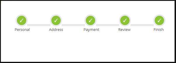
1. Visual checkout process: of course a one-click checkout page would be great, but if you can’t do that at least you could show the checkout process to your customers. It seems like the number of steps that compound you process is inversely proportional with your conversation rate.
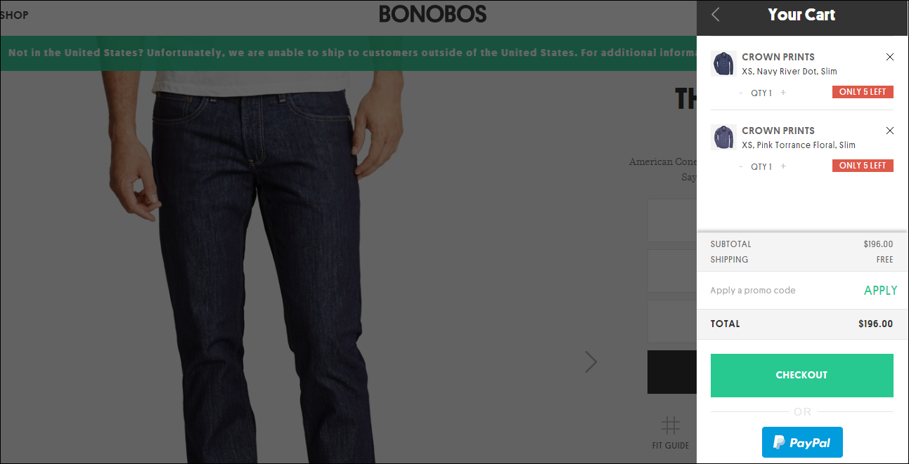
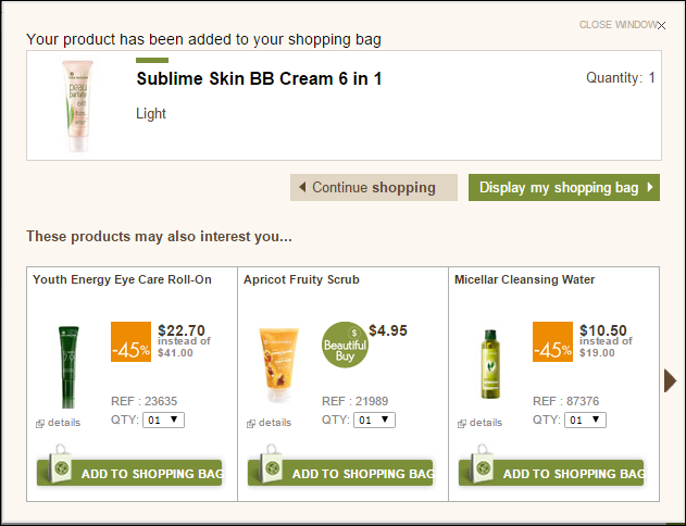
2. Add to cart confirmation: this confirmation may save you a lot of abandoned shopping carts because many people leave your website just because at the end, when they see the total, they think that’s too much for them. You could avoid this by displaying an “Add to cart” confirmation and a preview for your customer’s cart so he won’t get surprised by the end.
3. No forced registration: we all know that we would like to save all our customer’s addresses in our database in order to keep them up to date and send them our newsletters, but this could ruin some purchase intentions of your potential customers. Give them the option to place an order without creating an account.
4. Account after checking out: at the previous point we’ve told you that forced registration may be a barrier for your potential customers. Well, let us tell you now that by giving them the option to create an account after checking out may help you a lot. You will know that those people are now your clients, which is great if you have an upsell or cross sell strategy.
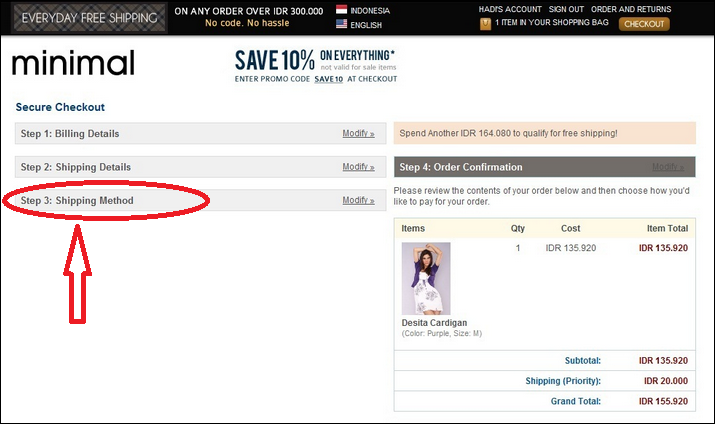
5. Detail shipping: a well-known reason people abandon their shopping carts is the shipping cost. Don’t amplify this and reveal the shipping methods before they give you all the details of their shipping address – it may be frustrating for them to see at the end that you can’t deliver their favorite products the way they want. Maybe you actually have a great promotion and you can give them free shipping don’t waste time and tell them about it!
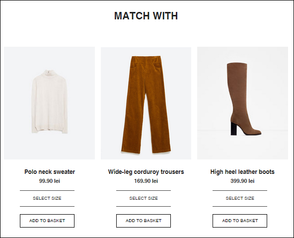
6. Recommended products: talking about cross sell and upsell, another way you can do that is by giving them some recommendations right in the checkout page. Many of your customers will appreciate it and they will think it is a great idea.
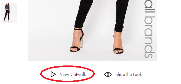
7. Product videos: if a picture is worth a thousand words than a video will worth ten thousand words! Try to make videos presenting your products – they will be more attractive for your customers because they want to see how those products fit a real person.
8. Great deals: people love discounts and you should love displaying your great deals. By showing your discounts in the checkout page you will avoid many cart abandonments. Many of you customers will buy those products with special prices, even if the total is over their budget. They will consider that discount like a one time offer and they won’t like to lose it.
9. Little gifts: your clients might love a little gift from you – a surprise discount or maybe another product. People talk about these gifts and share this kind of experiences with their friends, so you may gain some referrals. And don’t forget that you will make a good impression.
10. Usability: when talking about usability for your checkout page please consider this – place your information in a logical order, clear instructions, no distractions.
If you want to create a great checkout page, don’t forget to test what works better for you business. Try to adapt the tips above to your online shop and think about your audience when you implement all these changes.
Little steps might bring your great results!
How does your checkout page look like?
PS: Don’t forget to use retargeting to improve your cart abandonment!
Sources:
https://blog.kissmetrics.com/40-checkout-page-strategies/
https://econsultancy.com/blog/65398-11-of-the-world-s-best-ecommerce-checkouts/
http://conversionxl.com/how-to-design-an-ecommerce-checkout-flow-that-converts/
http://www.entrepreneur.com/article/250135
https://vwo.com/blog/anatomy-perfect-checkout-page/
Photos:
http://www.htmluse.com/21-free-jquery-css3-progress-bar-plugins-june-2014-for-html-use/
http://www.zara.com/ro/en/woman/blazers/blazer-with-elbow-patches-c756615p2965555.html
http://www.minimal.co.id/pages.php?pageid=39
https://bonobos.com/products/blue-jean?color=saratoga%20dark%20rinse&pant-fit=tailored&pant-length=32&pant-waist=30
http://www.yvesrocher.ca/control/makeup/
http://www.asos.com/new-look-tall/new-look-tall-supersoft-skinny-jeans/prod/pgeproduct.aspx?iid=5616540&clr=Black&SearchQuery=new&pgesize=36&pge=0&totalstyles=5091&gridsize=3&gridrow=1&gridcolumn=2
http://themissinformation.com/2014/08/20/skip-mall-shop-favorite-styles-online-shopping/