In order to talk about these 3 principles for effective CTAs, we will start by answering a very important question:
What is a Call-to-Action?
A call-to-action is an image or a text, that encourages your website’s visitors or your customers to take action. This is a key element used in a retargeting strategy.
The action, the goal, could be anything: join a group, attend an event, download an e-book, add a product to cart, try a software, read an article, etc. As we said before, it could be anything.
And you can use it anywhere: at the end of a blog post, on your website, at the end of a web form, in your e-book, etc.
Creating CTA buttons, especially for a retargeting campaign, could be very simple, but if you want them to be effective, you should consider these important principles.
1. Visibility
If you have a good call-to-action, but no one sees it, it doesn’t exist.
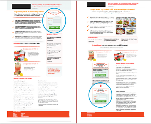
One question we have to answer is: it should be placed above or below the fold? Some studies show that 80% of a website’s visitors never scroll down. If this is your case, too, than you should place your CTA button above the fold.
On the other hand you should think to place it where it best supports the decision-making process.

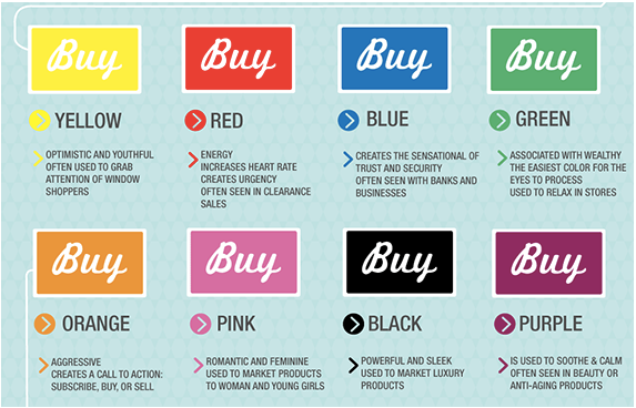
What about the color? We associate colors to specific feelings and we can use that to influence our prospects, but the most important thing you should consider is that your CTA button should have a contrasting color, considering your background.

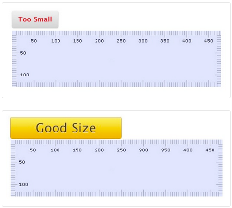
How big should your CTA be?
Large enough to be seen, small enough that it doesn’t turn people off.

2. Clear and compelling message
Your call to action has to be strong, but not too strong. When this is happening, your visitors feel like they take the action against their will. And remember that “The best marketing doesn’t feel like marketing.” – Tom Fishburne.
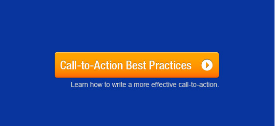
A CTA should clearly tell visitors what you want them to do:
- Buy
- Add
- Download
- Subscribe
- Read
- Register

When you create your call-to-action copy, as a part of a retargeting campaign but not only,try to:
- Begin With Verbs – if you’re not including a verb in your CTA copy, you are not encouraging your prospects to take action;
- Include Numbers – by using numbers in your copy you eliminate the guesswork and the vague statements from your message;
- Use Adverbs Sparingly – in relation to direction, time, degree, and manner;
- Keep it Between 90 and 150 Characters – try to keep your message clear and concise;
- Make Language More Practical – Stay away from overly technical jargon.
3. Choose supporting elements carefully
Testimonials, case studies or some social proofs are great for using them in email marketing and they may bust your conversion rates. These elements could actually help your customers take the right decision.
Make sure that all these supporting elements you use fit to your audience profile. The best way to do that is to use a retargeting software, that segments audience and delivers personalized messages according to browsing behavior.

It may sound complicated to create the best CTA for your website, but we recommend you to test all your ideas.
Don’t forget that A/B Testing, , also an important part of a retargeting strategy, saves you from failure.
Do you have any secret tips that you already use to share with us for an effective CTA?
Sources:
Photo credits:


Trackbacks/Pingbacks