Yes, today we’re talking about those moments when you’re reaching a non-existent page on your site, due to various reasons, like clicking on a broken link, the page has been deleted or you’ve simply mistyped a URL.
Regularly, the website detects this and in response to your request sends back an HTTP status code of 404, indicating that a page is not found. Still, enough with the technical aspects, as today we’re talking about how to create great 404 pages. Never though at this before? Well, you should, since a great 404 page can be as important as having great content. Therefore, if you don’t have an Error 404 page on your website or blog, you should start thinking about creating one right now!
But wait! You don’t want a boring 404 page, right? Right! When done properly, these pages can make your site famous, being shared on blogs and social media, as an example of how you care about the visitors and a great design approach. And, of course, you want all these things!
We’ve made a short list with tips on how to create great 404 pages, hoping that you will consider and start applying them pronto!
Here is your list:
- Include essential information on it
After all, the most effective 404 Error page should be relatively simple and tell users that there’s an error, alongside the options they have for moving forward from this page. Also, avoid technical jargon, since nobody will actually read it. Remember, the purpose of such page is to keep visitors clicking and reach what they’re interested in, not losing them!
- Make the 404 Error page usable
Even though it should be kept simple, the 404 Error page should also include some information that helps users navigate away from it or actually find what they’re looking for. In order to achieve this, here are some excellent tips:
- Make sure it has the same look as the rest of the site
- Add links to your most popular pages or articles, maybe those are the pages they’re looking for
- Think about a method visitors can use to report broken links or other errors
- Add a search box. It’s the easiest method to help people find what they were looking for
- Don’t make users scroll through it
I mean come on, what’s the whole purpose of making such a complicated 404 Error page? It’s not like users get there that often or spend too much time on it. It should stick to a simple, one-screen design, without a lot of gimmicks.
- Apologize
In some way or another, it’s your fault that a visitor got here, so be empathetic and say that you’re sorry for what happened. It’s ok to do this.
- Be creative and funny
This is basically the essential step in creating a great 404 Error page. Your page needs to stand out of the crowd. Just look at the folks over Google and their Error page when your Internet goes down. They have a freakin’ game with a jumping T-Rex over there and everybody was talking about it when they first introduced it. We know, that’s not a 404 Error page, but you got the idea.
Also, you might as well opt for a joke because hey, everybody loves jokes! Still, you need to make sure that all your audience gets it, so it’s recommended to test the page first.
So, ladies and gentlemen, this is where our list with tips on how to create great 404 Error pages ends, but we won’t leave you without any examples, so below you will find a selection with three error pages that should inspire you.
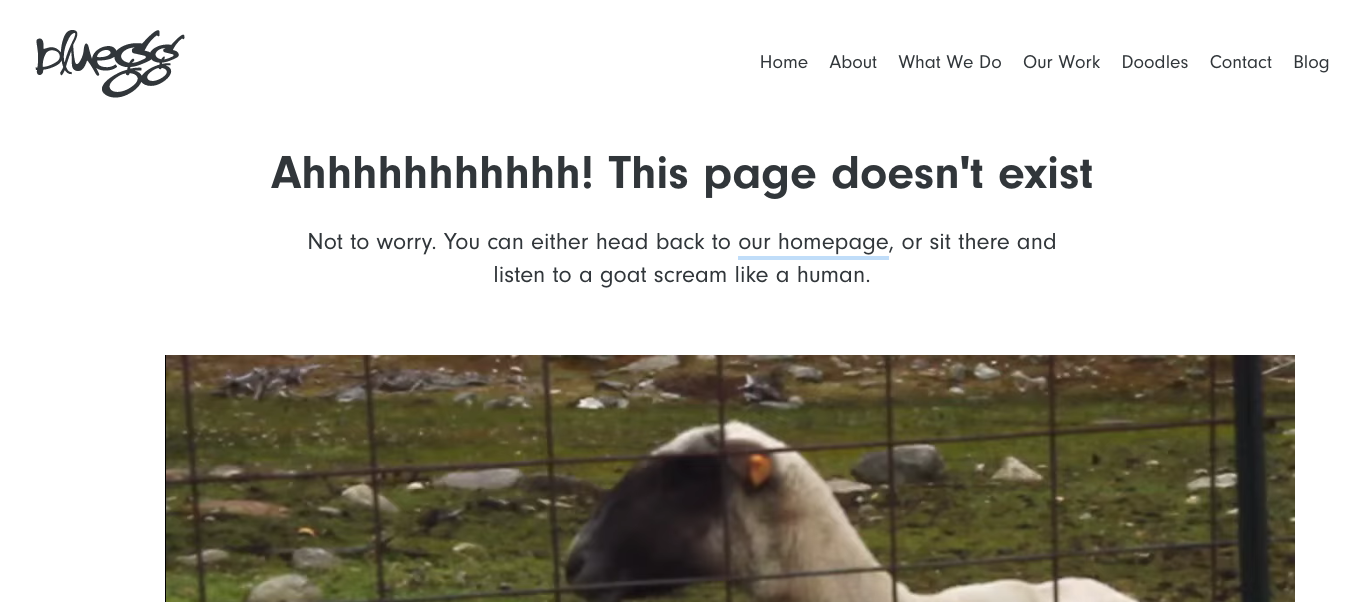
Bluegg – http://bluegg.co.uk/404
This is the page of a creative and digital agency, so don’t be surprised by what you’re going to see. If you ask us, this is absolutely hilarious, as they’ve taken the “make a joke” idea to a whole new level.

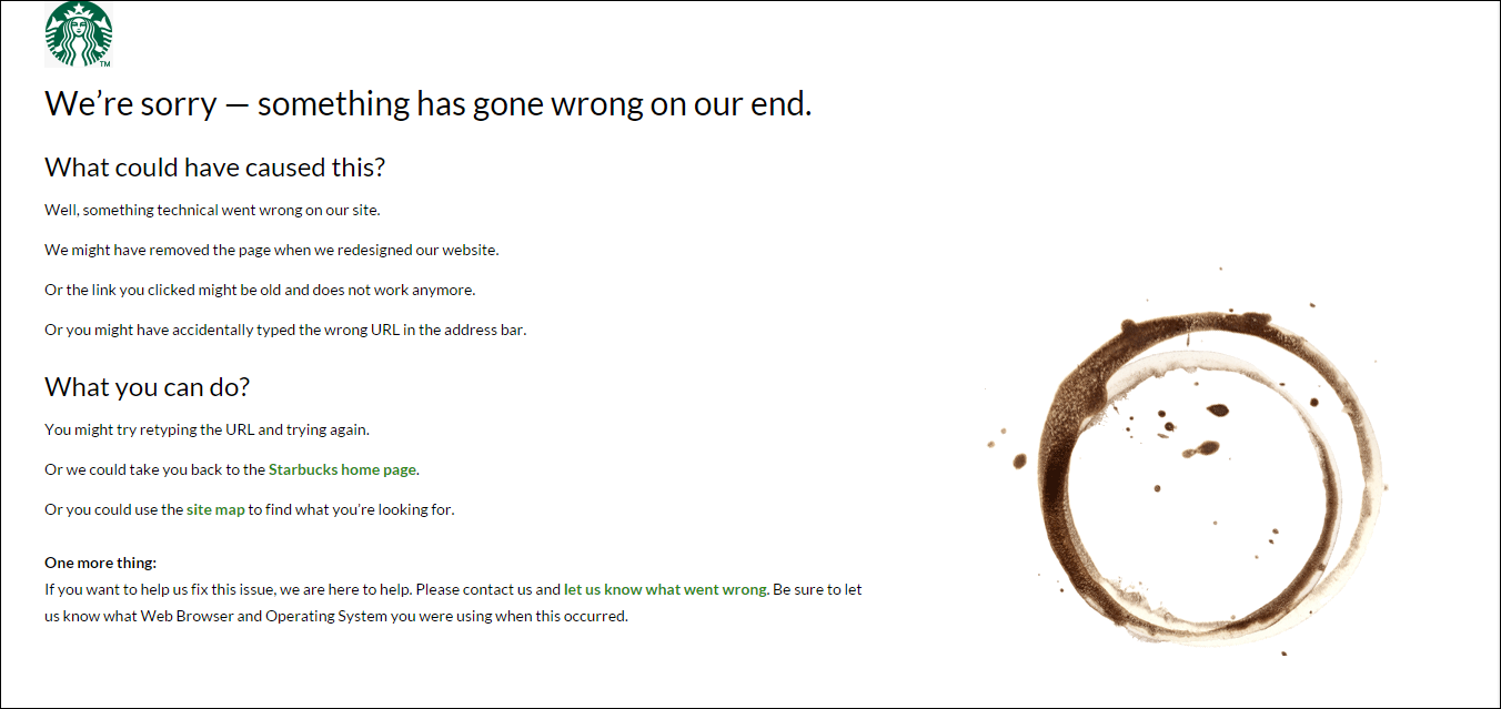
Starbucks – http://www.starbucks.com/static/error/index.html
This is an example of a company making good use of its primary product, even in the 404 Error page. It provides information on how to go back on the homepage and even asks the visitors to give some feedback, in order to avoid such situations.

Gig Masters – https://www.gigmasters.com/404
Another great and functional 404 Error page. Besides the smart correlation between the website’s niche and the background image, it also provides an interesting search bar, so you can find exactly what you want. In this case, everything you need for your event.

Hopefully, our guide will come in handy and you will design some great 404 Error pages for your websites! Also, our comments section is open, so if you know any other interesting error pages, feel free to share them with us!
Sources:
https://support.google.com/webmasters/answer/93641?hl=en
http://www.creativebloq.com/web-design/best-404-pages-812505
http://designshack.net/articles/inspiration/what-makes-a-great-404-error-page/
http://www.designtrax.de/inspiration/kreative-404-fehlerseiten.html

